Lecture 9 Consistency by Simulation
In this lecture we use simulation to watch an estimator get closer to the truth as the sample size grows, i.e. the consistency from lecture 2. We see this in three ways: through a single estimate as observations are added, through the sampling distribution at three sample sizes and through the mean squared error as a function of . On the way we extend the Monte Carlo skills from lecture 6 by a loop which varies the sample size. We conclude with a simulation which shows what lecture 8 means by a sufficient statistic. As before, appendix B contains a written reference for this topic.
9.1 A Running Estimate
In this section we simulate one long sample and watch the estimate change as the observations arrive one by one.
We will consider the exponential distribution with rate , where the maximum likelihood estimator for the rate is , as found in example 5.2. This estimator is consistent for by example 2.12 and proposition A.17. The most direct way to see the estimator at work is to simulate one long sample and to re-compute the estimate after each observation. The command cumsum can be used to compute the running totals , , in one step, and dividing the count by these totals gives all running estimates at once. Before you look at the plot, sketch the path you expect. Where is it most volatile?
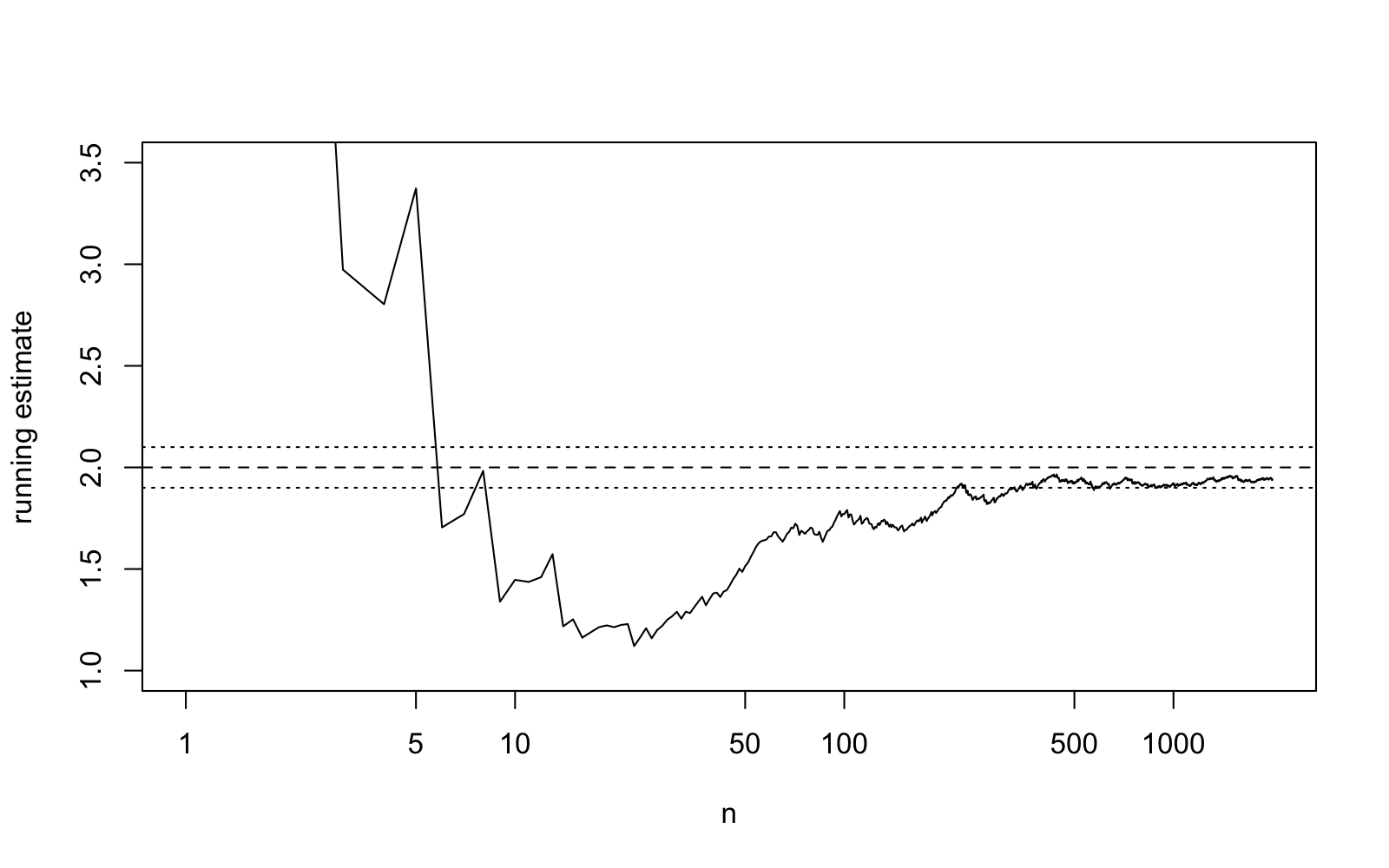
Figure 9.1 shows the expected behaviour: the path fluctuates strongly for small , crosses the edge of the band several times and ends inside it. A single path, however, cannot tell us how likely it is to be outside the band at a given , and this is what consistency is about.
9.2 The Sampling Distribution as Grows
In this section we compare the sampling distribution at three sample sizes and which fraction of estimates misses the truth by more than a fixed amount.
By definition 2.9, consistency means that for every band around the truth, here , the probability of missing the band goes to zero as increases. A probability is a property of many repetitions, and thus, as in lecture 6, we use replicate to compute independent estimates, at each of the sample sizes , and . The fraction of estimates outside the band estimates the probability; as in appendix B, the mean of a condition is the fraction of cases where it holds. Before you run the code, write down three guesses for the three fractions. Will the fraction for be close to zero?
set.seed(2026)est10 <- replicate(10000, 1 / mean(rexp(10, rate = theta)))est100 <- replicate(10000, 1 / mean(rexp(100, rate = theta)))est1000 <- replicate(10000, 1 / mean(rexp(1000, rate = theta)))c(mean(abs(est10 - theta) >= 0.1), mean(abs(est100 - theta) >= 0.1), mean(abs(est1000 - theta) >= 0.1))The probability of missing the band decreases from at to at , as consistency requires, but at it is still far from zero: the band is narrow, and consistency only says that the probability goes to zero eventually. To see the whole sampling distribution we draw the three histograms with a common horizontal axis, as in lecture 6. New is the argument freq = FALSE, which draws the histogram on the density scale, so that the total area of the bars is one and a narrower histogram must be a taller one. Values outside the horizontal range are not shown; for these are about of the estimates, almost all of them in the long right tail. The dotted lines mark the band.
par(mfrow = c(3, 1))hist(est10, breaks = 60, freq = FALSE, col = "grey85", main = "n = 10", xlab = "estimate", xlim = c(1, 3.5))abline(v = theta + c(-0.1, 0.1), lty = 3)hist(est100, breaks = 40, freq = FALSE, col = "grey85", main = "n = 100", xlab = "estimate", xlim = c(1, 3.5))abline(v = theta + c(-0.1, 0.1), lty = 3)hist(est1000, breaks = 40, freq = FALSE, col = "grey85", main = "n = 1000", xlab = "estimate", xlim = c(1, 3.5))abline(v = theta + c(-0.1, 0.1), lty = 3)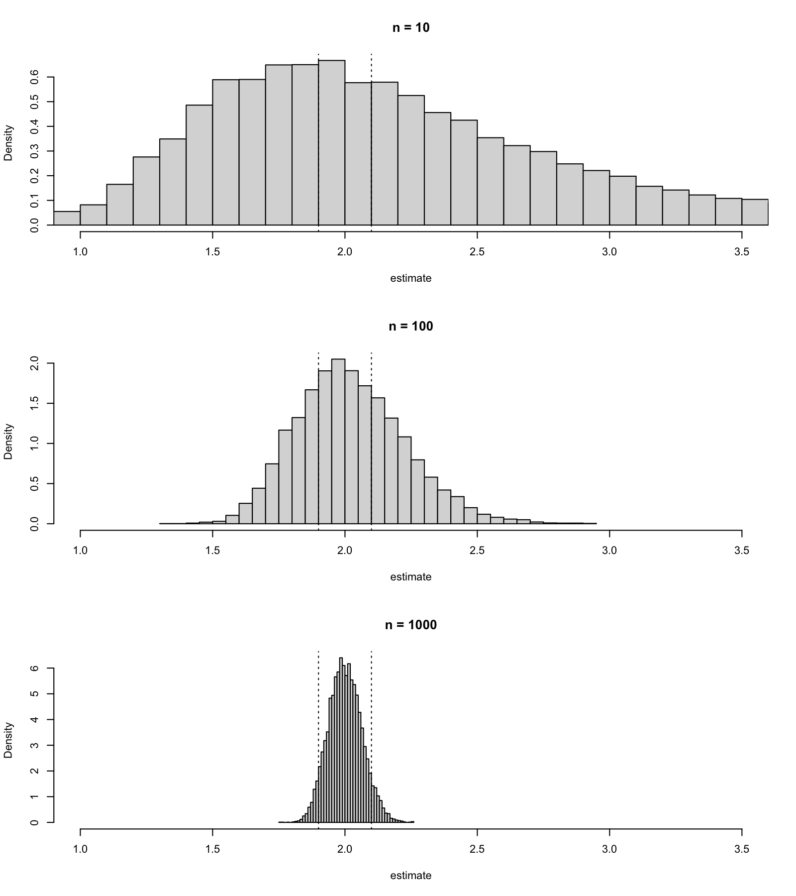
9.3 The Mean Squared Error as a Function of the Sample Size
In this section we estimate the mean squared error of two estimators for a range of sample sizes, collect the results in a table and plot them.
For a report a single number per sample size is often more useful than a histogram. In lecture 6 we estimated the mean squared error of the two uniform estimators and for . We now repeat this study for several sample sizes, which is the usual shape of a simulation study: an outer loop over a setting, an inner Monte Carlo run and a table of results. We first put both estimates into one function, so that both are computed from the same sample and returned as a vector of length two. The command replicate then collects the repetitions into a matrix, a rectangular table of numbers with two rows, one per estimator, and columns, one per repetition, and the command rowMeans can be used to average each row.
The outer loop runs over a vector ns of sample sizes, using seq_along(ns) to count through its positions. The command matrix(0, nrow = length(ns), ncol = 2) can be used to set aside a matrix for the results, mse[j, ] refers to the -th row of this matrix, and row and column names, set using rownames and colnames, can be used to make the matrix a readable table. As in lecture 6, the box below shows the complete script, with the lines of the loop kept together for clarity, but with the lines in a shuffled order.
Exercise. Before you read the script, you need to work out the correct order of lines to make the script work.
signif(mse, 3)for (j in seq_along(ns)) { ests <- replicate(10000, est_both(ns[j], theta)) mse[j, ] <- rowMeans((ests - theta)^2)}mse <- matrix(0, nrow = length(ns), ncol = 2)set.seed(2026)rownames(mse) <- nstheta <- 1colnames(mse) <- c("2 * mean", "max")ns <- c(5, 10, 20, 50, 100, 200, 500, 1000)The rule for writing R scripts is still in force: all names must be defined before they are used, so ns must come before the matrix is created and theta before the loop, the seed must be set before the loop starts, and the display (using signif to round the numbers) must come last. As in lecture 6, several orders satisfy these rules.
For the mean squared error of the maximum was approximately half of the one for . Before you run the reconstructed script, make a prediction. Will this ratio stay close to two for ?
theta <- 1ns <- c(5, 10, 20, 50, 100, 200, 500, 1000)mse <- matrix(0, nrow = length(ns), ncol = 2)set.seed(2026)for (j in seq_along(ns)) { ests <- replicate(10000, est_both(ns[j], theta)) mse[j, ] <- rowMeans((ests - theta)^2)}rownames(mse) <- nscolnames(mse) <- c("2 * mean", "max")signif(mse, 3)The values in each column decrease towards zero as increases, and thus both estimators are consistent by lemma 2.11. The ratio between the two columns is not close to two anymore: for the mean squared error for the maximum is smaller by a factor of approximately . This is expected, since the exact mean squared error of exercise 2.2 decreases like , while the exact value of exercise 4.4 decreases like . On log-log axes, which the argument log = "xy" selects, a quantity proportional to is a straight line with slope . The command points can be used to add a second set of points to an existing plot, with the plotting symbol chosen by the argument pch, and the command legend can be used to add a key. Will the two sets of points be parallel?
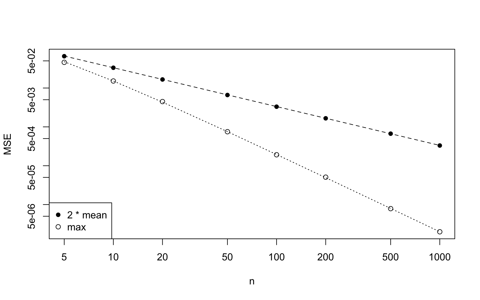
Both sets of points lie on straight lines: the slope is for and the slope is for the maximum. The rate is the usual rate of decrease for a mean squared error; it is the rate of the sample mean in example 2.8. The faster rate for the maximum is a consequence of the support of the uniform distribution moving with , the same feature which, by the remark after example 7.4 in lecture 7, keeps the uniform distribution out of the exponential families. We will consider this example again in lecture 13.
9.4 A Sufficient Statistic in R
In this section we check by simulation that the conditional distribution of a Poisson sample given its total does not depend on .
To conclude this lecture, we consider an example from lecture 8: for Poisson samples, the total is sufficient by example 8.6. By definition of sufficiency, given the total, the conditional distribution of the sample does not depend on . We can see this by simulation, without any algebra. We generate many Poisson samples of size , keep only those whose total equals , and look at the first observation in the kept samples; we do this for two different values of .
The command replicate returns a matrix with rows and one column per sample, colSums computes the column totals, and samples[1, totals == 10] selects from the first row the columns where the condition holds. The command table can be used to count how often each value occurs, and dividing by the number of kept samples turns the counts into proportions. Before you run the code, make a prediction. Will the two tables of proportions be different, since the two values of are different? What will the mean of the first observation be in each case?
first_given_total <- function(theta, N) { samples <- replicate(N, rpois(5, lambda = theta)) totals <- colSums(samples) samples[1, totals == 10]}set.seed(2026)first1 <- first_given_total(1.5, 100000)first3 <- first_given_total(3, 100000)c(length(first1), length(first3))round(table(first1) / length(first1), 3)round(table(first3) / length(first3), 3)c(mean(first1), mean(first3))The total equals for about of the samples when and for about when , so the two values of clearly matter for how often the total is . Once the total is fixed, however, the two tables agree up to simulation error, and both means are close to : given the total, the first observation has the same distribution whether or . This is definition 8.1 in action. All that the data can tell us about is carried by the total, and the distribution of the individual counts around it is the same for every . (The proportions in the table are themselves estimates; with about and kept samples the simulation error is between and for the larger entries.)
9.5 A Task to Take Home
The following task is a review of the topics of this lecture, in the style of a practical report. Following the structure of section 9.3, for the exponential rate with and sample sizes given in ns, estimate the bias and mean squared error of the maximum likelihood estimator using repetitions each, in a table with named rows and columns. Create a plot of the mean squared error against , using logarithmic axes. From the plot, determine the slope. Compare the empirical bias to the exact value from exercise 2.3. Write three sentences about what the table and plot show about the consistency of the estimator .
Before the next session, type in the commands from this session and check that the output matches what is shown in the text.
-
•
Appendix B is the written reference for cumsum, the matrices returned by replicate, colSums, rpois, table and legend.
-
•
The command cumsum can be used to compute all running estimates of a growing sample at once. One path shows an estimate settling down, but consistency is a statement about the probability of missing a band at a fixed , which only many repetitions can show.
-
•
When the Monte Carlo study is repeated at several sample sizes, the fraction of estimates outside the band decreases and the histograms get tighter around the truth. With freq = FALSE a histogram is drawn on the density scale.
-
•
A loop over a vector of sample sizes, with the results of each Monte Carlo run stored in one row of a matrix, gives the mean squared error as a function of . On log-log axes a mean squared error proportional to is a straight line with slope : for the uniform parameter, shows slope , the usual rate, and slope .
-
•
Keeping only the Poisson samples with a given total, the distribution of the first observation is the same for two different values of : the total is sufficient, in the sense of definition 8.1.